Responsive email templates fix this by automatically reformatting layouts for any screen size — desktop, tablet, or mobile — without the reader ever having to pinch or scroll sideways. For DTC brands where smartphones generated nearly 80% of global retail site visits in 2025, getting this wrong isn't a minor aesthetic issue. It's a revenue problem.
This guide covers what responsive templates are, why they matter for e-commerce, what makes them work technically, and how to start using them today.
Key Takeaways
- Responsive email templates automatically adapt layout, images, and CTAs across all devices
- Most shoppers browse on mobile; broken email layouts cost you sales before the first click
- Single-column layouts, percentage-based images, and tappable CTAs are the baseline for mobile-ready emails
- Klaviyo includes pre-built responsive templates ready to customize without coding
- Testing on a real device catches rendering issues that platform previews miss
What Are Responsive Email Templates?
A responsive email template is a pre-built email layout that automatically adjusts its structure, font sizes, images, and buttons to render properly on any device — no zooming required, no horizontal scrolling.
How the Technology Works
Responsive templates use three core techniques under the hood:
- Fluid columns that stretch or compress based on available screen width
- Percentage-based widths rather than fixed pixel values for images and containers
- CSS media queries that detect the viewer's screen size and apply different layout rules accordingly
Marketers using platforms like Klaviyo don't need to touch a line of code. This functionality is baked into the template — pick one from Klaviyo's library and the adaptation happens without any intervention.
Responsive vs. Static Emails
The difference is more significant than it sounds:
| Static (Fixed-Width) | Responsive | |
|---|---|---|
| Designed for | Desktop only | All screen sizes |
| On mobile | Text shrinks, images overflow | Layout reflows automatically |
| Column handling | Columns squeeze together | Columns stack vertically |
| CTA behavior | May fall off-screen | Repositions for thumb reach |
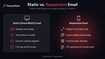
A typical example: a two-column product grid that looks clean on desktop becomes a cramped, unreadable mess on mobile with a static template. A responsive template collapses those columns into a single vertical stack — each product gets its own row, fully visible.
What Responsive Is NOT
True responsiveness goes beyond shrinking font sizes. An email that simply squishes its desktop layout onto a smaller screen doesn't qualify. A genuinely responsive template:
- Repositions elements so content flows naturally at any width
- Resizes images proportionally — no cropping, no overflow
- Keeps CTAs tappable and within thumb reach on touchscreens
- Stacks multi-column layouts into a single readable column
If your mobile subscribers are pinching to zoom or scrolling sideways, the template isn't responsive — it's just not broken enough to notice immediately.
Why Responsive Email Templates Matter for DTC E-Commerce
The DTC customer journey is almost entirely mobile-first. Someone finds your brand through an ad, browses on their phone, and receives your email on that same device minutes later. A broken email at that moment doesn't just disappoint — it destroys the conversion path you just paid to build.
The Direct Revenue Impact
Unreadable emails get deleted. For brands where email drives 30–40% of total store revenue, each broken send has a direct, measurable cost — not a rounding error.
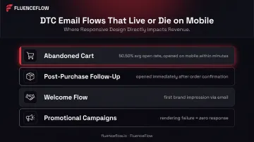
The email flows where this matters most are exactly the high-stakes ones:
- Abandoned cart sequences — averaging a 50.50% open rate across Klaviyo's benchmark data, these are often opened within minutes of cart abandonment, on the same mobile device
- Post-purchase follow-ups — opened immediately after order confirmation, frequently on mobile
- Welcome flows — a subscriber's first impression of your brand's email experience
- Promotional campaigns — time-sensitive sends where a rendering failure means zero response
The Compounding Deliverability Effect
Subscribers who consistently receive well-rendered, on-brand emails open future messages at higher rates. That engagement signals to inbox providers (Gmail, Apple Mail) that your emails are wanted — which improves deliverability over time.
The reverse compounds just as fast. Deleted or ignored emails train inbox providers to deprioritize your sends — and a degraded sender reputation is far harder to rebuild than it is to protect.
Key Elements of a High-Performing Responsive Email Template
Scalable Layout Structure
The foundation is a single-column layout or a multi-column layout that collapses correctly on mobile. Single-column is the safest choice — it works on every device without needing media query support.
For e-commerce specifically: product images should stack vertically on mobile rather than sitting side-by-side in a row that forces zooming. Each product gets its own row, its own visual attention, and its own tap target. This applies to product grids in promotional campaigns and to individual product shots in abandoned cart emails.
Touch-Friendly CTAs and Buttons
A text hyperlink that's easy to click on desktop becomes nearly impossible to tap accurately on mobile. Buttons in responsive templates need adequate size for thumb navigation.
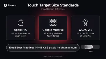
Design guidance adapted from Apple's Human Interface Guidelines and Google Material recommends:
- Apple: 44 × 44pt as the target for interactive controls
- Google Material: Minimum 48 × 48dp touch target
- WCAG 2.2: At least 24 × 24 CSS pixels at Level AA
For email, 44–48 CSS pixels in height is a practical usability target. Wider is better for buttons spanning the full column.
Button styling should use table-based HTML rather than CSS-only. Some email clients strip CSS styles entirely, which causes a CSS-only button to disappear completely, leaving subscribers with no CTA.
Images and Visual Content
Two rules apply to every image in a responsive template:
- Use percentage-based widths (
width: 100%,max-width: [intended desktop size]px) so images scale down without overflowing or distorting - Write descriptive alt text for every product image and banner — many email clients block images by default, so subscribers need something to read in place of your hero image
Image file size also matters on mobile data connections. Litmus data shows average image weight of 2.7MB in mobile-optimized emails, and that excess weight slows rendering on cellular connections. Compress images before uploading. For video, link a static thumbnail to the hosted version rather than embedding directly.
Typography and Readability
Font size recommendations for mobile email, per Litmus's accessibility guidance:
- Body text: Minimum 14–16px, with 16px preferred on smaller devices
- Headlines: Distinctly larger than body copy, with a clear visual hierarchy
Fonts that look fine at 12px on a large desktop monitor become unreadable on a 375px phone screen. Custom web fonts are another variable to plan for — many email clients won't render them. Always specify a web-safe fallback (Georgia, Arial, sans-serif) so the layout holds when your branded font fails to load.
How to Use Responsive Email Templates (Step by Step)
Step 1: Choose Your Email Platform and Template Source
The easiest starting point is the template library built into the email platform you're already using. For Shopify brands on Klaviyo — the standard for DTC email — the drag-and-drop editor includes pre-built responsive templates for welcome series, abandoned cart, post-purchase flows, and promotional sends. Starting from a platform template means the responsive coding is already in place.
Step 2: Customize Within the Template's Structure
What to update:
- Swap in your brand colors, logo, and font choices
- Replace placeholder images with your product photography
- Rewrite the headline, body copy, and CTA text
- Set the correct destination URLs for all links
Critical rule: don't drag elements outside the template's existing column structure or manually override column widths. This is the most common way to break a template's responsiveness — and it's not always obvious until you check the mobile preview.
Step 3: Preview Across Devices Before Sending
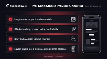
Every major email platform includes a built-in preview showing desktop and mobile rendering. In Klaviyo's preview tool, check:
- Do images scale proportionally on mobile?
- Is the CTA button large enough to tap comfortably?
- Is body text readable without zooming?
- Does the layout stack into a single column on small screens?
Step 4: Send a Test Email and Review on a Real Device
Platform previews show you the intent — a real device shows you the truth. Before scheduling any campaign, send a test to yourself and at least one team member. Open it on a phone and a desktop email client, and check image loading, link functionality, and whether the layout holds together.
For larger sends or templates with complex layouts, dedicated testing tools go further:
- Litmus — previews rendering across 100+ client environments simultaneously
- Mailgun Inspect (formerly Email on Acid) — similar cross-client coverage with inbox placement insights
Responsive Email Template Best Practices
Three standards worth applying on every send:
- Keep email width at 600px for the main content container. Klaviyo's 2025 documentation confirms 600px as its default and the industry standard for marketing email. Content inside the container should use percentage-based widths to stay fluid.
- Write a plain-text version of every HTML email. Most platforms auto-generate this, but auto-generated plain text is often garbled — review and clean it up before every send.
- Compress all images before uploading. Large files slow rendering on mobile data connections. Also stay under Gmail's 102KB HTML clipping threshold and hides your CTA behind a "View entire message" link.
When Pre-Made Templates Aren't Enough
Pre-built responsive templates are a reasonable starting point. They handle the technical responsiveness correctly, and for brands early in their email program, they get emails out the door fast.
The ceiling becomes clear when your emails start looking identical to every other brand using the same platform library. Generic templates are built to be universal — which means they're not built around your visual identity, your product photography style, or your customer's actual buying behavior.
Custom responsive email design solves a different problem. It's not just about aesthetic differentiation. At FluenceFlow, the starting point isn't a template: it's the brand's unit economics.
Two examples show why this matters:
- High-AOV brands (like Sartoro, custom menswear) need extended nurture flows with trust-building content and a restrained, premium visual language
- Consumables brands (like Carroll's Corn) need urgency-driven layouts, replenishment timing baked into the sequence architecture, and flavor-preference segmentation feeding the flow logic
Those are structurally different email systems. The template exists to serve the economics, not the other way around. For DTC brands doing real volume — where email drives 30–40% of total store revenue — the design and architecture decisions compound across every send.
Frequently Asked Questions
Do responsive email templates work in all email clients?
Most modern clients — Gmail, Apple Mail, iOS Mail, Android Mail — support responsive design. Outlook on Windows is the main exception, with limited CSS support across several versions. Well-built templates use table-based HTML as a fallback so the email stays usable even when media queries don't fire.
What's the difference between a responsive email and a mobile-friendly email?
"Mobile-friendly" means the email doesn't look broken on a small screen — fonts readable, content visible. "Responsive" goes further: the layout actively adapts to detected screen size, stacking columns, resizing images, and repositioning CTAs. One adjusts passively; the other adapts by design.
Do I need coding skills to create a responsive email template?
No. Drag-and-drop editors in platforms like Klaviyo and Mailchimp allow full customization without writing code. HTML/CSS knowledge is only needed if building a template from scratch outside the visual editor.
Can I use responsive email templates in Klaviyo?
Yes. Klaviyo includes a library of pre-built responsive templates for common DTC flows — welcome series, abandoned cart, post-purchase, and promotional sends. All templates auto-adapt for mobile and desktop, and the built-in preview tool shows rendering on both before you hit send.
How do I know if my email template is actually responsive?
Three quick checks: use your platform's device preview tool, send a test email and open it on an actual mobile phone, and run it through a tool like Litmus or Mailgun Inspect to preview rendering across 100+ client environments.
What email width should I use for a responsive email template?
The industry standard is 600px for the main content container. This displays correctly across desktop email clients and scales down on mobile. Going wider risks horizontal scrolling on some desktop clients. Use percentage-based widths for content inside the container to keep it fluid across screen sizes.