Email design isn't about decorative flourishes. It's about creating templates that load quickly on mobile devices, communicate brand messages instantly, guide readers to a single clear action, and remain accessible when images don't load. Many brands struggle with image-only emails that appear blank, overcrowded layouts that confuse rather than convert, and desktop-only designs that break on smartphones. The stakes are high: Mailchimp's December 2023 e-commerce benchmarks show average open rates of 29.81% and click rates of just 1.74%, meaning most brands are leaving revenue on the table with every send.
This guide covers the essential elements of high-performing email design, from header structure and CTA placement to mobile responsiveness and accessibility. You'll learn practical best practices backed by platform guidance, common mistakes that tank engagement, and real examples of what works for DTC brands.
Key Takeaways
- Clean layouts, prominent CTAs, and mobile-first design turn brand consistency into measurable revenue
- Every template needs a branded header, scannable live-text body, one dominant CTA, and a compliant footer
- Responsive single-column layouts are required so emails adapt cleanly across devices and inboxes
- Live text, ALT attributes, contrast, and lightweight HTML improve both accessibility and deliverability
What Email Design Is and Why It Matters
Email design is the process of building visual and structural templates that carry your brand message and drive a clear next step. In practice, that work covers:
- Layout hierarchy and scannable structure
- Typography and color
- Image optimization
- CTA placement and wording
- Responsive behavior across clients and devices
- Accessibility and modular, reusable components
Most DTC teams build these in a visual template editor (such as Klaviyo) with text, images, buttons, and saved modules; no custom code required for standard campaigns.
Good email design shows up differently at each stage of the journey:
- Before the open: Design is mostly invisible. Open rate hinges on sender name, subject line, and preheader (and Apple Mail Privacy Protection can distort open metrics).
- After the open: Hierarchy and scannable structure decide whether someone reads or deletes.
- Click-through: Your CTA has to stand out and state the value in a glance.
- Conversion: Placed-order rate and revenue per recipient show whether the layout actually guided people to buy.
What the benchmarks show
- Mailchimp (Dec 2023): 29.81% avg open rate, 1.74% click rate, 0.19% unsubscribe rate (billions of sends to lists of 1,000+)
- Klaviyo (2024 report): $0.11 avg campaign revenue per recipient vs. $3.65 for abandoned-cart flows (325B+ emails in 2023)
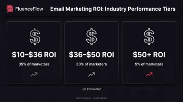
- Litmus (2025 survey): 35% of marketing leaders report $10–$36 ROI per $1 on email; 30% report $36–$50; 5% report $50+ (~500 global respondents)
No study isolates design alone from timing, targeting, and content. Set your baseline, then A/B test one design variable at a time so you can see what actually lifts clicks, conversions, and revenue per email for your list.
Essential Email Design Elements
Header Components
Your header establishes immediate brand recognition and sets the tone for the entire email. Campaign Monitor recommends keeping branding consistent across all customer touchpoints: colors, fonts, buttons, and icon style should match your website and other channels.
Place your logo prominently. Left-aligned vs. centered placement isn’t settled, so test both with your audience.
Eyebrow copy above the main content can highlight timely offers or announcements without cluttering the core message. If you include navigation links in your header, keep them minimal: one or two key categories at most. Complex menus increase load time and distract from your primary conversion goal.
Body Content: Visuals and Copy Balance
Never send image-only emails. When images are blocked by default in many email clients, your message appears completely blank. Litmus emphasizes a mix of live text and purposeful, lightweight images.
Live text wins on accessibility and deliverability:
- Loads immediately when images are blocked
- Stays searchable and works with screen readers
- Adapts to user font-size preferences and translation tools
Structure your content for scannability using clear hierarchy:
- Headline first: Use size, weight, and placement to make your primary message instantly clear
- White space: Separate content chunks visually so readers can process information quickly
- Typography choices: Stick to web-safe fonts or properly embedded custom fonts; maintain consistent font families and sizes
- Color psychology: Use color strategically to emphasize key elements and guide the eye
Campaign Monitor recommends an inverted-pyramid structure: concise headline, supporting information or visuals, then a prominent CTA. This approach works best when you have one clear message and one primary action per email.
Call-to-Action Design
Your CTA is the conversion moment. Design choices here either earn the click or bury it. Litmus recommends placing your primary CTA early in the email and optionally repeating it after longer content.
Effective CTAs share these traits:
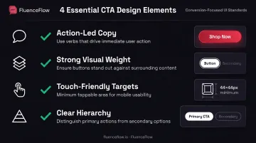
- Action-led copy: Set clear expectations ("Shop Now," "Claim 10% Off," "Get Started")
- Strong visual weight: Size, color contrast, and white space make the button easy to spot
- Touch-friendly targets: Apple’s minimum is 44×44px; add surrounding white space to cut misclicks
- Clear hierarchy: If you need a second CTA, subordinate it with smaller size, lower contrast, or a text link instead of a button
Test CTA count with your audience; no universal rule proves "one CTA" always outperforms "two CTAs." For single-message campaigns promoting one product or offer, one dominant action typically converts better than competing choices.
Footer Requirements
Your footer must comply with legal requirements while providing useful functionality. The FTC's CAN-SPAM Act requires clear identification that the message is an advertisement, a valid physical postal address, and a clear, conspicuous opt-out mechanism that works for at least 30 days. You must honor opt-out requests within 10 business days.
If you serve EU subscribers, GDPR grants them a free, anytime right to object to direct marketing; that right must be presented clearly and separately from other footer content.
Beyond compliance, use your footer for:
- Preference center links so subscribers can adjust frequency or content types rather than unsubscribing completely
- Social media icons to encourage cross-channel engagement
- Secondary navigation to key website sections
- Brief brand messaging or value proposition reminders
Mobile Responsiveness
Responsive design isn't optional. Mobile is a primary reading environment for most e-commerce brands, even though exact device splits vary by list. Check your Klaviyo analytics for your subscribers' real device breakdown.
Campaign Monitor's mobile-optimization checklist includes:
- Single-column layout: Vertical content flow works across all screen sizes
- 600-640px maximum email width: Ensures proper rendering on small screens
- Touch-friendly buttons: Generous tap targets with surrounding white space
- Scalable fonts: Minimum 14px for body text, 22px+ for headlines
- Whitespace-separated content chunks: Makes scanning easier on small screens
Klaviyo's editor builds responsive emails automatically, but always preview on actual devices or through testing tools before sending to your full list.
Email Design Best Practices
Build a modular system
Create a modular design system with reusable content blocks so every campaign stays on-brand and ships faster. In Klaviyo, that system usually includes:
- Blocks for text, images, and buttons
- Sections and columns for grouping content
- Template-level and global styles for fonts, colors, and logos
- A Universal Content library for headers, footers, product showcases, and social icons
Save those pieces once, then assemble new emails from proven parts instead of rebuilding from scratch.
Prioritize layout and hierarchy
Use a single-column layout for mobile readability. Vertical flow removes horizontal scrolling and adapts cleanly to any screen width, critical when most subscribers open on their phones.
Pair that layout with a clear visual hierarchy: headline, supporting copy, then CTA. Size, color, and placement should make the next step obvious within a few seconds of opening.
Maintain brand consistency with a standard color palette, typography system, and logo placement. Every email should read as the same brand, even when the offer or story changes.
Optimize images and accessibility
Optimize images for fast loading:
- Compress images without visible quality loss
- Keep individual images under 1MB
- Keep total email HTML under 80KB when you can (Gmail clips messages above 102KB)
- Use web-optimized formats (JPEG for photos, PNG for graphics with transparency)
Design with accessibility in mind:
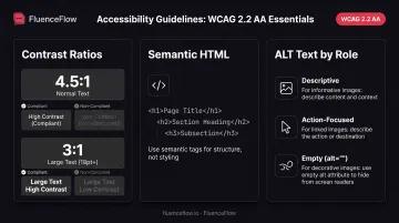
- Meet WCAG 2.2 AA contrast: 4.5:1 for normal text, 3:1 for large text (18pt+ or 14pt+ bold)
- Use semantic HTML with proper heading tags, meaningful link text, and logical structure
- Write ALT text by role: descriptive for informative images, action-focused for linked images, empty for decorative ones
- Check the linear read order so the message still makes sense without visual formatting
Lock these rules into your templates and Universal Content blocks. New campaigns inherit fast load times, clear hierarchy, and accessible structure by default.
Design Principles for High-Converting Emails
One Primary Goal Per Email
Focus on a single conversion objective. Decide whether you want subscribers to shop a new collection, claim a discount, read a blog post, or take another action. Then design every element to support that one goal. Multiple competing messages reduce clarity and dilute results.
Color, Contrast, and Brand Consistency
Use color with intent:
- Enough contrast between background and text to stay readable
- Accent colors that pull the eye to CTAs
- Consistent brand colors that build recognition over time
The 60-30-10 rule (60% dominant neutral, 30% secondary, 10% accent for CTAs) is a common convention, but no email-specific evidence proves it lifts conversions. WCAG contrast ratios are the requirement that actually holds up.
Urgency and Scarcity (When They Fit)
Create urgency and scarcity through design when the offer warrants it. Elements that often drive faster action include:
- Countdown timers
- Limited-stock indicators
- Bold expiration messaging
Litmus reports that Alterra Mountain Co. used countdown timers and saw improvements in click rate and revenue per recipient, though specific values weren't published. Timer tools such as Litmus Personalize support branded designs, expiration states, template embedding, and fallback images across 100+ email clients.
Dynamic Personalization
Personalize design elements when you have the data. Useful modules include:
- Recommended products from browse or purchase history
- Location-specific offers
- Images tied to subscriber preferences
Litmus's 2023 survey of 1,200+ email professionals found 64% used dynamic-content personalization, with 38% reporting "much improved" performance. Those results were self-reported and not e-commerce-specific; test personalized modules against static controls with your own audience.
Design Around Your Unit Economics
Custom systems built around unit economics usually beat generic templates. When flows and campaigns match your margins, buying cycle, customer behavior, and product category, strategic and visual alignment tends to deliver stronger results.
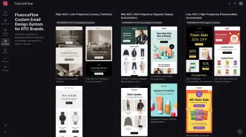
That is the approach FluenceFlow takes with DTC brands: conversion-focused layouts tailored to high-AOV/low-frequency, mid-AOV/mid-frequency, or low-AOV/high-frequency models, rather than one-size-fits-all industry templates.
Common Email Design Mistakes to Avoid
Three design mistakes show up again and again in underperforming campaigns:
- Image-only emails appear blank when images don't load, exclude screen-reader users, show tiny mobile text, skip preheader content, and load slowly. Keep critical information in live text.
- Overcrowded designs stack too many CTAs and competing messages, which confuses subscribers and cuts conversions. One clear message with one dominant action beats a cluttered multi-choice layout.
- Skipped mobile testing turns desktop-perfect emails into broken mobile experiences for most of your list. Preview across devices and email clients before every full send.
Tools and Resources for Email Design
Klaviyo offers a no-code responsive email editor with blocks and sections, a universal content library, global style controls, device and recipient display logic, and hybrid custom HTML support. It's the best fit when design and e-commerce personalization live in the same platform.
As a Klaviyo Certified Partner, FluenceFlow builds custom lifecycle systems directly in clients' Klaviyo accounts. Brands retain 100% ownership of all flows, emails, segments, and popups.
Canva provides customizable email-newsletter templates for quick asset and template creation. It works for early design concepts, but it doesn't guarantee cross-client rendering quality.
Adobe Creative Cloud tools cover specific production roles:
- Photoshop for email images
- InDesign for composition review
- XD for prototyping
- Creative Cloud Libraries for shared assets
These are creative-production tools, not inbox-rendering validators.
Litmus and Email on Acid offer pre-send previews and testing across 100+ email clients and devices. Use them to catch broken layouts, font problems, and image-loading failures before subscribers see them.
When to work with specialists
Consider partnering with an experienced agency when you need:
- Custom HTML and interactivity beyond drag-and-drop builders
- Accessibility expertise for compliance and inclusive design
- Comprehensive QA across dozens of email clients
- Strategic campaign management without enough internal capacity
Base the decision on required technical depth and internal resources, not arbitrary revenue thresholds. Klaviyo Certified Partners can build custom email design systems around your unit economics and business model instead of generic templates.
Frequently Asked Questions
How should an email header look?
Keep headers simple: logo prominent (left-aligned or centered), optional eyebrow copy for timely offers, and minimal navigation. Complex menus pull focus from your main goal and slow load time.
What is the best email structure?
Use a branded header, a hero with your primary headline, scannable body content with clear hierarchy, one strong CTA, and a compliant footer (unsubscribe link and physical address). Campaign Monitor's inverted-pyramid layout (headline, support, CTA) works especially well for single-message campaigns.
What are some creative email design ideas?
Try bold minimalist type with generous white space, countdown timers, personalized product blocks, or light gamification when it supports conversion. Always test interactive features across email clients and include fallback content.
Should I use templates or custom designs for my emails?
Templates win for speed, consistency, and brand standards at high volume. Custom designs often convert better when built around your brand, unit economics, and clear goals. Test both and judge by click rate, conversion rate, and revenue per email.
How do I know if my email design is working?
In Klaviyo, track open rate (with Apple Mail Privacy Protection caveats), click-through rate, conversion rate, and revenue per email. Benchmarks sit near 29.8% open and 1.74% click (Mailchimp) and $0.11 revenue per recipient (Klaviyo), but your trend lines and single-variable A/B tests matter more.