Introduction: Why Popup Design Matters for E-commerce Revenue
Most shoppers find popups annoying, yet well-designed popups reliably capture emails and drive conversions. The difference between a popup that frustrates visitors and one that builds your list comes down to execution.
According to Wisepops' 2026 platform data, email-signup popups averaged 4.82% conversion rates. E-commerce popups specifically averaged 6.88%, with mobile outperforming desktop at 4.98% versus 3.67%.
For direct-to-consumer brands, popups are a first touchpoint in retention marketing. They capture the email and SMS subscribers who enter your welcome flows, abandoned-cart sequences, and long-term campaigns.
Klaviyo's 2026 guidance treats a 3%+ submit rate as a solid result, while top campaigns exceed 20%. Integrated with your retention system, those subscribers drive ongoing revenue through email and SMS.
This guide covers popup design examples and best practices so you can turn more store traffic into subscribers who buy again.
Key Takeaways
- Well-timed popups with clear value propositions convert at 3-7% on average, with top performers reaching 20%+
- Exit-intent, scroll-based, and cart-triggered popups outperform instant-display overlays by preserving user experience
- Mobile-optimized designs with simplified forms and larger touch targets (48+ pixels) prevent abandonment
- Integration with Klaviyo welcome flows and automated campaigns transforms popup captures into long-term revenue
- Testing timing, offers, and design variations systematically increases conversion rates over time
What Makes a Great Popup? The 3 Core Elements
Three things separate popups people accept from ones they slam shut: when they appear, what they offer, and how easy they are to dismiss.
Strategic Timing and Triggers
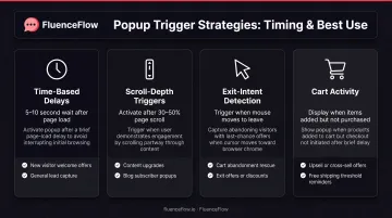
Great popups appear at moments of natural pause or demonstrated intent rather than interrupting immediately upon landing. Platforms like Klaviyo support time-based delays, scroll-depth triggers, exit-intent detection, cart activity, and page-specific rules. While there's no universal "perfect" timing window, testing different triggers reveals what works for your audience.
Common trigger strategies include:
- Time-based delays: Waiting 5-10 seconds lets visitors see your content before presenting an offer
- Scroll-depth triggers: Showing popups after 30-50% scroll indicates engagement
- Exit-intent detection: Capturing visitors as they move to leave, especially with items in cart
- Cart activity: Triggering offers when visitors add products but haven't checked out
Clear Value Exchange
Effective popups offer something tangible in return for the interruption. Real campaigns show how specific offers perform:
- BOOM!: prominent 10% off first order, nearly 40% acceptance
- Tiny Beast Designs: 15% off plus a countdown timer, 23.51% conversion
- Natural Vital: free gift with urgency, 31.42% conversion and 226,498 HUF (~$600 USD) over a 26-day test
The value proposition must be specific, not vague. "Get 15% off your first order" converts better than "Join our newsletter for exclusive offers." Your headline should state the benefit immediately, with minimal copy separating the visitor from the action.
Easy, Obvious Dismissal
Preserve trust by making dismissal simple. Nielsen Norman Group found overlays with clear X buttons were less likely to be dismissed accidentally, while hidden swipe-only controls created frustration.
Klaviyo places an X at the top right and can allow outside-click dismissal. Visitors who don't want the offer should close it in one click; no hunting for controls or fake close buttons.
10 Popup Design Examples That Actually Convert
Example 1: Email Capture with Value Proposition
Clean, minimal designs that clearly state the benefit consistently outperform busy layouts. The most effective email-capture popups include:
- Single form field (email address only)
- Benefit-focused headline ("Get 15% off your first order")
- High-contrast CTA button
- Optional dismissal link below the form
One field, one benefit, one button; enough clarity to convert without slowing the page experience.
Example 2: Two-Step Email + SMS Popup
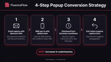
Splitting email and SMS capture into two steps reduces friction while maximizing data collection. One documented implementation increased form submissions by 638.57% and drove a 17.34% revenue lift.
The strategy works by:
- Capturing email first with a clear discount offer
- Presenting SMS opt-in on step two with additional value
- Converting the dismissed form into a sticky countdown timer
- Reopening the capture form at exit intent
Each step asks for less upfront, so you collect more data across the session without a single heavy form.
Example 3: Exit-Intent Cart Abandonment Popup
Exit-intent popups trigger when users signal they're about to leave with items still in cart. Natural Vital used a free gift offer with an "I want the gift" CTA and a countdown timer, achieving 31.42% conversion over 26 days.
Effective cart-abandonment popups include:
- Visual display of cart contents
- Limited-time discount or free shipping offer
- Urgency elements (countdown timers, low-stock warnings)
- Single-click redemption
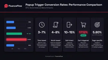
OptiMonk's 2025 data reports average cart-abandonment popup conversion of 17.12%, significantly higher than standard email-signup popups at 5.10–7.65%.
Example 4: Product Recommendation Quiz Popup
Quiz-style popups help overwhelmed shoppers find the right product while gathering preference data. Multi-step engagement qualifies leads by asking about needs, preferences, or use cases before recommending specific products.
This format works best for:
- Large product catalogs
- Complex purchase decisions
- Products requiring fit or preference matching
- Brands needing zero-party data for personalization
The popup initiates the quiz, then transitions to a dedicated landing page for the full experience.
Example 5: Browse Abandonment with Urgency
Popups that appear after significant browsing without conversion can recover otherwise lost sessions. Kiss My Keto combined a 15-minute countdown clock with a 15% discount and auto-redeem coupons, achieving 15.05% conversion.
Key urgency elements include:
- Countdown timers creating time pressure
- Low-stock warnings highlighting scarcity
- Limited-time language ("Offer expires in 15 minutes")
- Immediate redemption (no code required)
Example 6: Mobile-Optimized Email Capture
Mobile design requires specific considerations beyond responsive scaling. Klaviyo's mobile guidance specifies 1–3 fields maximum, 1–2 CTA buttons, and at least 48-pixel touch targets with 8+ pixels between elements.
Mobile-first principles include:
- Larger touch targets for thumbs, not mouse cursors
- Simplified copy with minimal text
- Full-screen or bottom slide-up formats
- Single-column layouts
- Reduced form fields
Wisepops reports mobile converting at 4.98% versus desktop's 3.67%, making mobile optimization a revenue priority.
Example 7: Post-Purchase Cross-Sell Popup
Popups appearing after checkout recommend complementary products while customers are still in buying mode. Timing is critical; the offer must appear without disrupting or delaying the primary purchase confirmation.
Effective post-purchase popups:
- Appear on the thank-you page, not during checkout
- Recommend genuine complements, not random products
- Offer a small additional discount or free shipping
- Keep messaging brief and benefit-focused
You capture add-on revenue after the order is safe, no risk to the primary conversion.
Example 8: Gamified Spin-to-Win Popup
Interactive popups using gamification increase engagement through variable rewards and instant gratification. Wisepops reports spin-to-win wheels averaging 10.15% conversion, with the top 10% reaching 30.38%.
Psychological triggers include:
- Element of surprise (what prize will I win?)
- Instant gratification (immediate reveal)
- Perceived fairness (everyone wins something)
- Playful interaction breaking typical popup patterns
Example 9: Welcome Intent Popup for New Visitors
Targeted popups appearing only to first-time visitors with special welcome offers improve relevance while avoiding repeat-visitor fatigue. Wisepops reports standard discount lightboxes for new visitors averaging 4.82% conversion, with the top 10% reaching 19.77%.
Segmentation strategy includes:
- Cookie-based visitor identification
- Separate offers for new versus returning visitors
- Frequency capping to prevent repeated displays
- Suppression after conversion
Example 10: Social Proof + Email Capture Combination
Combining customer reviews, ratings, or testimonials with signup forms reduces skepticism and increases trust. Lammle's used bestseller and FOMO popups highlighting product popularity and urgency, reporting a 17.3% sales increase.
Effective social-proof elements:
- Recent purchase notifications
- Customer review snippets
- Star ratings and testimonial quotes
- "X people are viewing this product" messages
Social proof validates the offer while the popup captures contact information.
Popup Design Best Practices for E-commerce Brands
Timing and Triggers: The Science of When to Show
Trigger selection matters more than design alone. Platforms provide multiple options, each suited to different visitor behaviors:
Time-based triggers work for engaged visitors who've seen enough content to judge your brand. Testing should compare delays of 5, 10, 15, and 30 seconds to find your optimal window.
Scroll-based triggers indicate genuine interest. Visitors who scroll 30-50% have engaged meaningfully with your content and may be more receptive to an offer.
Exit-intent triggers capture leaving visitors at their moment of decision. These work especially well for cart abandoners and browsers who've viewed multiple products.
Cart-triggered popups tap into high-intent moments. OptiMonk reports cart-abandonment popups convert at 17.12%, versus 5.10-7.65% for standard email capture.
Page-specific triggers let you tailor offers to content. Wisepops reports 5.80% conversion for page-specific campaigns versus 2.30% for sitewide popups.
Klaviyo explicitly recommends A/B testing different trigger types against each other to identify what works for your audience.
Design and Visual Hierarchy: Making Popups Clear and Compelling
Visual best practices focus attention and remove decision friction:
- Use contrasting colors to separate the popup from page content
- Lead with a clear value proposition above the form
- Offer one focused CTA, not multiple competing options
- Keep form fields minimal (email only, or email plus one field)
Klaviyo's 2024 article cites 4.96% average conversion for popups containing images versus 3.80% overall, suggesting visual interest improves performance.
Mobile responsiveness requires specific attention:
- Full-screen takeovers for high-value offers versus slide-ups for lighter touches
- Thumb-friendly close buttons (minimum 48 pixels)
- Simplified copy for smaller screens
- Vertical layouts that don't require horizontal scrolling
Google advises against full-page intrusive interstitials on mobile, favoring elements occupying only a small screen fraction.
Copy and Messaging: Writing Popup Text That Converts
Benefit-focused headlines outperform generic invitations:
High-converting copy:
- "Get 15% off your first order"
- "Free shipping on orders over $50"
- "Claim your free gift before checkout"
Generic copy:
- "Join our newsletter"
- "Sign up for updates"
- "Stay in touch"
Copywriting formulas that work include:
- Benefit + specific value: "Save 20% when you subscribe"
- Action + outcome: "Join 10,000+ customers saving daily"
- Urgency + benefit: "Claim your 15% discount; offer expires in 10 minutes"
Optional dismissal language matters too. "No thanks, I prefer paying full price" performs better than a bare X button by framing the dismissal as the visitor's active choice.
Personalization and Targeting: Showing the Right Popup to the Right Person
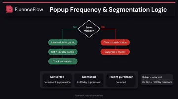
Segmentation transforms generic overlays into relevant offers. Klaviyo supports targeting by:
- New versus returning visitor status
- Cart value and cart contents
- Browsing behavior and viewed products
- Geographic location
- Traffic source (organic, paid, email, social)
- Device type
Avoiding popup fatigue requires deliberate suppression:
- Frequency capping (showing popups every X days)
- Cookie-based suppression after dismissal
- Permanent suppression after conversion
- Exclusions for recent purchasers
Zero-day frequency shows the popup every visit. Most brands set 7-30 day caps to balance list growth with user experience.
Integration with Email Marketing: Connecting Popups to Your Retention Strategy
Popup captures feed into Klaviyo flows and automated campaigns. New subscribers enter a welcome series immediately, while cart abandoners and browsers trigger recovery sequences.
Retention partners like FluenceFlow design custom popup experiences that connect directly to email and SMS systems. Align popups with welcome series, abandoned cart recovery, post-purchase nurture, replenishment reminders, and winback campaigns, and list growth turns into repeat revenue. FluenceFlow clients average 41% of total store revenue from email and SMS.
Common Popup Design Mistakes That Kill Conversions
Even a strong offer fails when the popup creates friction. These four mistakes show up constantly on DTC stores, and each one is fixable.
Instant interrupts. Popups that appear before visitors see any content drive immediate bounces. Wisepops has reported a 10-15% bounce increase from instant popups, so give people time to engage first.
Vague value props. Copy like "Join our community" or "Subscribe for updates" loses to a concrete offer. State the benefit clearly: discount percentage, free shipping threshold, or exclusive product access.
Hard-to-close controls. Hidden X buttons, fake close targets, or no easy dismissal option frustrate users and erode trust. Nielsen Norman Group recommends clear, predictable dismissal controls.
Broken mobile layouts. Desktop-designed popups with tiny text and buttons fail on phones. Meet the 48-pixel touch-target minimum and test on real devices, not browser simulators alone.
How to Implement High-Converting Popups on Your E-commerce Site
High-converting popups need the right tool, intentional design, smart triggers, and steady testing. Work through the steps below so you grow the list without getting in the way of the purchase path.
Choose the Right Popup Tool or Platform
Popular popup tools for Shopify stores include:
| Tool | Shopify Rating | Starting Price | Key Features |
|---|---|---|---|
| Klaviyo | 4.7 (2,988 reviews) | Free; Email $20/mo | Native forms, targeting, analytics, A/B tests; no connector needed |
| Privy | 4.5 (3,968 reviews) | Displays $24/mo | Unlimited displays, multi-step forms, advanced targeting |
| OptiMonk | 4.8 (419 reviews) | Essential $29/mo | AI builder, personalization, analytics, A/B tests |
| Justuno | 4.6 (587 reviews) | $59/mo | Exit, cart, countdown, quiz, SMS forms; segmentation |
| Popupsmart | 4.8 (50 reviews) | Basic $39/mo | AI builder; unlimited popups; A/B testing from Advanced tier |
| Wisepops | 4.9 (63 reviews) | $299/mo | Cart recovery, upsell, FOMO, AI recommendations |
Klaviyo forms are native; the other tools integrate with Klaviyo for email and SMS capture. Match features, ease of use, and pricing to your store size and list-growth goals.
Design Your Popup with Conversion in Mind
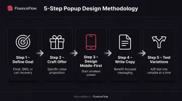
Follow this design process:
- Define your goal: Email capture? SMS subscribers? Cart recovery?
- Craft a compelling offer: Be specific about value (15% off, free shipping, free gift)
- Design mobile-first: Start with the smallest screen, then scale up
- Write benefit-focused copy: Lead with what the visitor gets, not what you want
- Test variations: A/B test headlines, offers, designs, timing, and targeting
Klaviyo advises testing one variable at a time, waiting for statistical significance, and not editing live tests mid-flight.
Set Up Smart Targeting and Triggers
Configure trigger conditions based on visitor behavior:
- Page URLs: Show different popups on product pages versus homepage
- Visitor behavior: Target based on scroll depth, time on site, or pages viewed
- Cart status: Trigger special offers when items are added but not purchased
- Frequency rules: Suppress popups for visitors who've already converted or dismissed recently
Layering URL, behavior, cart, and frequency rules gets complex quickly. Retention-focused brands often hand that work to specialists like FluenceFlow. FluenceFlow designs and implements popup campaigns inside broader email and SMS programs, delivers three custom design directions in the first week, then handles technical setup, A/B tests, and Klaviyo welcome-flow integration.
Test, Measure, and Optimize Performance
Track these key metrics:
- Conversion rate / submit rate: Submitted forms divided by popup views
- Email capture rate: New subscribers added
- Revenue attributed: Sales tied to popup-captured subscribers
- Bounce rate impact: Whether popups increase immediate exits
Klaviyo's 2026 benchmark puts a solid submit rate at about 3%+. Wisepops reports e-commerce averaging 6.88% in 2026, while top performers exceed 20%.
Iterative optimization includes:
- Testing timing changes (5 seconds vs. 10 seconds vs. exit-intent)
- Design variations (image vs. no image, single-step vs. multi-step)
- Offer improvements (10% off vs. free shipping vs. free gift)
- Copy refinements (generic vs. benefit-specific headlines)
Frequently Asked Questions
How to design a popup?
Define a clear goal and offer, then use a simple layout with a benefit-focused headline, obvious CTA, and easy dismiss control. Optimize for mobile (48+ px touch targets) and trigger on time, scroll depth, or exit intent, not on instant load.
What is the difference between a popup and a dialog box?
Popups are marketing overlays used for signups, discounts, or announcements. Dialog boxes are functional UI elements that collect decisions for system tasks like confirm delete or save changes. Marketing popups drive conversion; system dialogs collect user input.
What are some examples of really good popups?
BOOM!'s 10% OFF email-capture popup hit nearly 40% acceptance. Natural Vital's exit-intent free-gift popup with a countdown converted at 31.42%. Gamified spin-to-win wheels average 10.15%, with top performers at 30.38% (Wisepops).
What are some creative ideas for popups?
Try spin-to-win wheels, multi-step product quizzes, video demos, seasonal countdown timers, referral invites, or personalized product recommendations. Pairing social proof (reviews, recent purchases) with the capture form also lifts trust and conversion.
What are some creative mobile popup designs?
Use bottom slide-up banners that keep content visible, full-screen takeovers with one clear CTA, and swipeable multi-step forms. Add thumb-zone CTAs for one-handed use and minimalist layouts with short copy and ample white space.