Shopify reports that just 1.6% of ecommerce visits convert to purchases. That means 98.4% of your traffic walks away without buying. And without their contact information, you've paid to acquire them once with no ability to bring them back.
Email and SMS signup forms solve this problem by turning anonymous visitors into owned audiences you can market to repeatedly, at zero additional acquisition cost. This article covers the strategic, design, and technical elements that separate high-performing signup forms from those that barely move the needle, plus 12 real examples from DTC brands.
Key Takeaways
- Signup forms recapture paid traffic, converting one-time visitors into owned channels with zero ongoing acquisition cost
- Match incentives (discount, free shipping, or gift) to your margins and purchase frequency
- Design and placement can lift form conversion from 1.5% (underperforming) to 5%+ (excellent)
- Test one variable at a time (incentive, copy, or trigger timing) to learn what your audience actually responds to
- Track revenue per subscriber over raw signup count so you optimize for downstream performance
What Makes an Email Signup Form Convert
An email signup form is the mechanism that captures visitor contact information (typically email address, sometimes phone number) in exchange for something the visitor values. In the e-commerce customer journey, it sits between awareness and purchase, giving you a second (and third, and fourth) chance to convert browsers into buyers.
The core principle is simple: visitors trade their information for something of equal or greater perceived value. That exchange must feel fair. A 10% discount on a $200 jacket? Fair. A vague promise to "stay updated"? Not compelling.
Your form needs to address three visitor types:
- High-intent shoppers who are ready to buy but may need a small nudge
- Browsers who are interested but not yet convinced
- First-time visitors who don't know your brand and need education before purchase
Owned email lists beat relying on social followers or repeat organic visits because you control the channel. Instagram can change its algorithm tomorrow. Email inboxes don't.
Omnisend analyzed 1.24 billion popup displays and found that average popup conversion sits at 2.1%. Here's how to interpret your own performance:
| Conversion Rate | Classification |
|---|---|
| Below 1.5% | Underperforming |
| 1.5% - 3% | Average |
| 3% - 5% | Good |
| 5%+ | Excellent |
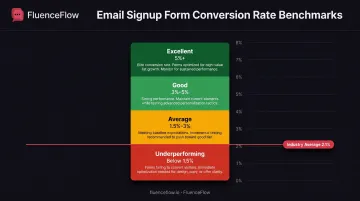
If your form converts below 1.5%, you're leaving subscribers and revenue on the table.
Strategic Incentive Selection: What to Offer in Exchange for an Email
The incentive is the foundation of your signup strategy. Everything else (design, copy, placement) matters, but if the offer isn't compelling, the rest won't save your conversion rate.
Common Incentive Types
- Percentage discounts (10%, 15%, 20% off first order): Best for immediate revenue when margins allow. Simple and universally understood.
- Dollar-amount discounts ($10 off, $25 off orders over $100): Stronger for higher-AOV brands where a fixed amount feels more substantial than a percentage.
- Free shipping: Appeals to cost-conscious shoppers, especially when AOV sits near your free-shipping threshold.
- Free gifts with purchase: Protects margin while still feeling tangible. Ideal for tight margins or low-cost add-ons.
- Gated content (guides, quizzes, style recommendations): Builds trust when buyers need education first. Fits complex products or longer consideration cycles.
- Contests and giveaways: High signup volume, often lower purchase intent. Use when list growth is the primary goal.
Decision Framework: Match Incentive to Your Business Model
- Revenue-focused brands with healthy margins: Use discounts to accelerate first purchase, then measure lifetime value.
- Margin-conscious brands with thin first-order economics: Prefer free gifts, content, or loyalty access over cutting price.
- Lower-intent audiences (cold traffic, broad targeting): Lead with giveaways or educational content that builds trust before a purchase ask.
The Math: Calculate Your Incentive Cost
Before committing to an incentive, calculate its actual cost against expected return.
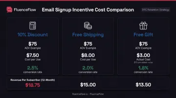
- 10% discount on $75 AOV = $7.50 cost per conversion
- Free shipping ($8 average cost) on $75 AOV = $8 cost per conversion
- Free gift (product cost $3, perceived value $15) = $3 cost per conversion
If your 10% discount converts at 2.5% but free shipping converts at 2.0%, the discount is still more profitable if the margin impact is acceptable.
Omnisend's data shows popups offering discounts convert at 2.4% versus 1.7% without them: a 41% relative lift. Conversion rate alone doesn't tell the full story.
Measure revenue per subscriber, not just signup rate. A 5% signup rate full of leads who never buy loses to a 3% rate that attracts serious buyers.
Design Best Practices That Drive Signups
Good design does more than look professional. It directs attention, communicates value instantly, and removes friction from the signup process.
Form Placement: Where Visitors See Your Offer
- Popup overlays (timed or scroll-triggered): Highest-converting option. Show after 6-10 seconds or 50% scroll so you don't interrupt immediately.
- Exit-intent popups: Trigger when the cursor moves toward the back button or close tab. Captures visitors on their way out.
- Embedded forms (homepage, product pages, blog): Lower conversion than popups, but less intrusive on high-traffic pages where people expect content.
- Sidebar or header bars: Stay visible without blocking content. Lower conversion, steady presence sitewide.
According to Omnisend, desktop-and-mobile popups convert at 2.2%, compared with 1.4% for desktop-only. Build every placement mobile-first.
Write Benefit-Focused Headlines
Your headline must communicate the value visitors receive, not what you want.
Weak: "Sign Up for Our Newsletter" Strong: "Get 15% Off Your First Order"
Weak: "Join Our Community" Strong: "Unlock Free Shipping + Early Access to New Arrivals"
The difference is specificity and self-interest. Tell visitors exactly what they get and why it matters to them.
Use Visual Hierarchy to Guide the Eye
Contrasting colors make the CTA button impossible to miss. If your site uses muted tones, make the button bright and bold.
Whitespace around key elements (headline, email field, CTA) prevents visual clutter and focuses attention.
Bold CTAs with action verbs ("Claim Your Discount," "Get My 15% Off," "Unlock Free Shipping") outperform passive language like "Submit" or "Join."
Ask for Email Only (Or Email + SMS on Multi-Step)
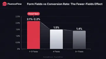
Every additional field reduces conversion.
Omnisend data shows forms with 1-3 fields convert at 2.1%–2.2%, while 4-field forms drop to 1.5% and 5+ fields fall to 1.4%.
Unless you need a detail for a specific flow (birthday for a birthday discount, product interest for tailored recommendations), skip first name, last name, and preferences at signup. Capture those later, after trust is established.
For SMS, use a multi-step form: email first, phone number on the next screen. One ask at a time keeps the form from feeling heavy.
Set Clear Expectations
Tell subscribers what they'll receive, how often they'll hear from you, and that you respect their privacy.
Example: "Get 10% off your first order plus weekly style tips and exclusive offers. Unsubscribe anytime."
Include a link to your privacy policy near the form to build trust and comply with regulations.
Mobile Optimization Is Not Optional
According to Shopify, smartphones account for 78% of retail site traffic and 70% of online shopping orders. If your form fails on mobile, you lose most of your audience.
Mobile checklist:
- Large, tappable email input field
- CTA button at least 44x44 pixels
- Vertical layout that doesn't require horizontal scrolling
- No tiny text that forces pinch-to-zoom
- Fast load time (under 2 seconds)
Technical Optimization for Higher Conversion
Strategic design earns attention. Technical optimization clears the friction that still kills signups.
Multi-Step Forms Outperform Single-Step (Slightly)
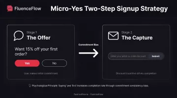
Multi-step forms break the signup process into smaller commitments. Instead of asking for email and phone number simultaneously, you ask visitors to agree to the offer first, then collect contact details on the next screen.
Klaviyo's data shows that multi-step email forms achieve a 2.85% median submission rate versus 2.27% for single-step forms, but the difference was not statistically significant. For SMS forms, multi-step converted at 2.98% versus 2.58%, also without statistical significance.
Omnisend reported 2.3% for multi-step versus 2.0% for single-step, a directional preference but not a guaranteed win.
Multi-step forms often win, but not always. Test them on your audience and offer before you standardize.
The "Micro Yes" Strategy
Before asking for an email address, ask the visitor to agree to the value proposition.
- Offer first: "Want 15% off your first order?" - Yes / No Thanks
- Details second: After they click Yes, "Enter your email to claim your discount."
This creates a commitment bias. Once visitors say "yes" to the offer, they're more likely to complete the form.
Single Opt-In vs. Double Opt-In
- Single opt-in: Email is added to the list as soon as the visitor submits
- Double opt-in: Visitor must click a confirmation link before they're subscribed
Email: Single opt-in maximizes list growth. Double opt-in improves contact quality and cuts spam risk, but fewer people finish. Mailchimp notes that double opt-in reduces spam complaints and validates addresses, without publishing specific conversion lifts.
SMS: Use double opt-in or explicit consent confirmation. FCC rules require prior express written consent before marketing texts, and confirmation messages help document that consent.
Practical default: Single opt-in for email unless deliverability is already a problem. Always meet SMS compliance requirements.
A/B Test One Variable at a Time
Random changes don't produce insights. Structured testing does.
Test only one variable per experiment:
- Incentive value: 10% off vs. 15% off
- Copy: Benefit-focused vs. urgency-driven headline
- Design: Button color, form placement, image vs. no image
- Trigger: 5 seconds vs. 10 seconds, scroll depth vs. exit-intent
Run tests until you reach statistical significance (typically 95% confidence) before declaring a winner. Small sample sizes produce misleading results.
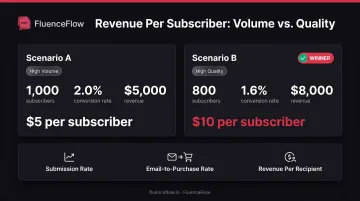
Measure these metrics:
- Submission rate (how many see the form vs. submit)
- Email-to-purchase conversion rate (how many subscribers buy)
- Revenue per recipient (total revenue divided by total subscribers captured)
Don't optimize submission rate alone. A form that captures 1,000 subscribers at 2% conversion and drives $5,000 in revenue loses to one that captures 800 at 1.6% and drives $8,000.
Email Signup Form Examples from DTC Brands
The following examples represent different strategies, incentives, and design approaches from real ecommerce brands. Not every tactic will fit your audience. Test and measure what does.
Example 1: Brightland – Multi-Step Free Gift Offer
Incentive: Free spout with purchase Design: Clean, product-focused imagery with two-step flow Why it works: Protects margin while providing tangible value. The spout is low-cost to Brightland but high perceived value to customers buying olive oil.
Example 2: Our Place – Sweepstakes with Social Proof
Incentive: Free pan giveaway Design: Prize image, testimonials, clear entry CTA Why it works: High perceived value (free cookware worth hundreds of dollars) drives signup volume. Social proof ("Join 100,000+ members") adds credibility.
Example 3: Caden Lane – Discount + Segmentation Question
Incentive: 15% off sitewide Design: Discount offer plus baby/child life-stage question Why it works: Captures email and zero-party data in one step, so follow-up can match the customer's stage (expecting, newborn, toddler).
Example 4: Wild Fork Foods – Free Shipping + Privacy Transparency
Incentive: Free shipping Design: Clear value prop with email-use, unsubscribe, terms, and privacy disclosures Why it works: Free shipping appeals to cost-conscious shoppers. Transparency about email frequency and opt-out builds trust.
Example 5: Minecraft Official Store – Minimalist Discount Popup
Incentive: 10% off first order Design: One field (email only), bold CTA, minimal text Why it works: Removes all friction. No images, no lengthy copy: just the offer and a clear CTA.
Example 6: Cheeky Wipes – Product Interest Selector
Tactic: Product category interest selector Design: Dropdown or buttons for category preference with the email field Why it works: Segments subscribers at signup so campaigns can match product preference from the first send.
Example 7: Wilkinson Sword – Discount + Gender Preference
Incentive: 20% discount Design: Discount offer plus male/female/both product preference selector Why it works: Pairs a strong discount with preference data so welcome content and offers match the products each subscriber actually wants.
Example 8: Kosmo's Q – Two-Step Micro-Commitment
Incentive: Discount offer Design: Step 1: "Want a discount?" [Yes/No] → Step 2: Email field Why it works: Micro-yes strategy increases commitment. Visitors who click "yes" are psychologically primed to complete the form.
Example 9: Josh Wood Colour – Post-Submit Discount Code + CTA
Incentive: Discount code revealed after signup Design: Thank-you screen displays code and "Shop Now" button Why it works: Immediate gratification plus clear next step. Code visibility encourages instant purchase.
Example 10: Wu-Tang Clan Official Shop – Mobile-Optimized Vertical Layout
Focus: Mobile-first layout over heavy creative Design: Vertical form, no photography, large tappable fields Why it works: Fast load, easy thumb reach, and no horizontal scroll; built for the mobile traffic most DTC stores actually get.
Example 11: Edinburgh Skincare – Loyalty Rewards Flyout
Incentive: Loyalty program access Design: Click-triggered flyout promoting points and rewards Why it works: Appeals to repeat-purchase intent. Loyalty programs increase LTV without discounting first order.
Example 12: Living Proof – Embedded Footer Form with Content Promise
Incentive: Styling tips, how-to guides, and exclusive offers Design: Simple embedded form in footer Why it works: Less intrusive than a popup, always visible, and aimed at shoppers who want education first. The content promise sets up tips and guides, not only promo blasts.
How FluenceFlow Optimizes Signup Forms for Client Success
Retention marketing agencies approach signup form optimization differently than generic best-practice advice because they're accountable for revenue outcomes, not just list growth.
FluenceFlow builds signup strategies based on client unit economics: average order value, purchase frequency, and margin, rather than one-size-fits-all templates. A premium brand with $400 AOV and a 6-month buying cycle needs a completely different form strategy than a consumable brand with $45 AOV and 30-day replenishment.
Delivery in the first week of engagement covers:
- Custom popup design with three directions to choose from
- Technical implementation and A/B testing setup
- Welcome-flow integration tied to the new form
One documented comparison showed a popup generating $17,000 in revenue at a 0.72% submit rate, while an optimized version produced $141,000 at a 10.03% submit rate.
The form is just the entry point. Real revenue comes from what happens after signup:
- Welcome series that convert cold subscribers into buyers
- Segmentation that delivers relevant messages
- Lifecycle flows that turn one-time customers into repeat purchasers
Frequently Asked Questions
What are the 3 P's of email signup forms?
The 3 P's are Placement (where the form appears: popup, exit-intent, or embedded), Promise (the incentive offered for contact information), and Process (how easy it is to complete). All three need to work together to convert.
What information should I ask for in my signup form?
Ask for email address as the minimum. Add phone on a second step if you run SMS. Skip first name, birthday, or preferences unless you have a tested segmentation plan that doesn't hurt conversion.
Should I use a popup or embedded form?
Popups typically convert higher (around 2.1% average) but feel intrusive if shown too early. Use both strategically: popups on high-intent pages and for new visitors; embedded forms on content-heavy pages. Match placement to page type and visitor behavior.
How do I know if my signup form is performing well?
Benchmark your submission rate: 2-3% is average, 5%+ is excellent. Also track how many subscribers buy and revenue per subscriber. A lower signup rate that attracts buyers beats a high rate of unqualified leads.
What's the best incentive to offer for email signups?
Match the incentive to your goal: discounts for immediate revenue (if margin allows), free gifts for margin protection, or educational content for authority. Optimize for revenue per subscriber, not signup volume alone.
How often should I test and optimize my signup forms?
Test major elements (incentive, discount value, design, placement) quarterly. Monitor metrics continuously and A/B test when you have a clear hypothesis. High-traffic stores can test monthly; lower-traffic stores need longer windows for significance.