Introduction: Why Form Design Matters for E-Commerce Success
Poor form design is silently bleeding billions from e-commerce. Cart abandonment sits at 70.22%, and among shoppers who abandon for reasons beyond browsing, 17% cite overly long or complicated checkout forms as the reason they walked away.
Better checkout design alone could recover an estimated $260 billion in lost orders across US and European e-commerce.
Forms appear at every critical conversion point between a visitor and revenue, not only on checkout pages. Email signups, account creation, contact forms, and SMS opt-ins all stand between your traffic and your retention channels. When Klaviyo benchmarks show that 3% submit rates count as successful for popups, most stores leave money on the table because their forms create unnecessary friction.
This guide covers research-backed form design principles that reduce abandonment, help shoppers finish faster, and turn more visitors into customers.
Key Takeaways
- Poor form design is the final barrier before conversion; simplifying it directly lifts revenue
- Single-column layouts with top-aligned labels and fewer required fields raise completion rates and speed
- Mobile forms need appropriate keyboards, larger tap targets, and persistent labels to reduce errors
- Inline validation catches mistakes early and cuts failed submissions
- A/B testing shows which practices actually improve completion for your audience
Form Design Fundamentals: Planning Before You Build
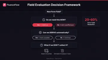
Audit what you actually need. Before designing a single field, distinguish between information you must collect now versus data that's merely convenient. Research shows most checkout forms can reduce visible elements by 20-60% simply by removing optional or deferrable fields.
The average US checkout presents 23.48 form elements when 12-14 would suffice.
Ask three questions for every field:
- Do we need this now, or can we ask later?
- Can we derive this automatically (geolocation, browser data, purchase history)?
- What happens if we simply don't collect it?
Map your information architecture logically. Group related fields under clear section headings: "Contact Information," "Shipping Address," "Payment Details."
Sequence from easiest to hardest: start with familiar fields like name and email, then progress to more complex inputs. This builds momentum and reduces early abandonment.
Decide between single-page and multi-step formats. Field count affects usability more than page count. An eight-field single-page form often outperforms a four-step process with twelve total fields.
Multi-step layouts work when you have:
- 10+ required inputs
- Clear logical groupings
- Moments where showing progress reduces anxiety
Include a progress indicator if you go multi-step.
Essential Form Layout and Structure Principles
Use Single-Column Layouts for Better Completion Rates
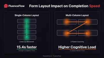
Single-column forms create a clear vertical path that eliminates decision fatigue. CXL Institute tested 702 participants and found single-column forms were completed 15.4 seconds faster than multi-column versions, a statistically significant improvement at 95% confidence.
The vertical flow reduces cognitive load. Users scan straight down without jumping horizontally to check whether they missed a field. Multi-column layouts force Z-pattern eye movement, slowing comprehension and increasing errors.
Exception: Closely related fields like City/State/ZIP can occasionally share a row when the relationship is obvious and the combined width fits comfortably on mobile screens.
Position Labels Above Input Fields, Not Beside Them
Top-aligned labels support faster vertical scanning, stay visible while users type, and work more predictably with screen readers. Eye-tracking research shows top-aligned labels reduce eye fixation time to roughly 50 milliseconds, compared to 500+ milliseconds for left-aligned labels that force horizontal scanning.
Left-aligned labels create three problems:
- They require back-and-forth eye movement between label and field
- They disappear from view on narrow mobile screens
- They complicate responsive design, often forcing labels above fields on mobile anyway
Group related fields visually and logically. Use whitespace, section headings, or subtle dividers to separate blocks like Billing Address from Payment Method, or Account Details from Shipping Preferences. Clear groups show the form's structure and speed error correction: when validation flags Payment Details, users know exactly where to look.
Arrange checkboxes, radio buttons, and lists vertically. Vertical choice lists support the single-column principle and improve scannability. Nielsen Norman Group notes that horizontal checkbox arrangements obscure label-control associations and make options harder to compare quickly. Vertical stacking also keeps options from wrapping awkwardly or getting cut off on smaller screens.
Consider Multi-Step Forms for Long or Complex Processes
When forms exceed 10-15 visible fields, breaking them into logical steps can reduce overwhelm. Multi-step designs create psychological momentum: completing step one feels like progress, encouraging users to continue.
Critical requirements for multi-step forms:
- Show a progress indicator (step 2 of 4, or a visual progress bar)
- Keep each step focused on one logical category
- Allow users to move backward without losing data
- Ensure the total field count is actually necessary. Don't add steps just to split an already-short form
Field-Level Design Best Practices
Minimize the Number of Input Fields
Every additional field increases abandonment risk. Baymard's checkout research found the average site can reduce form elements by 20-60% by eliminating optional fields, combining related inputs, and deferring non-essential data collection.
Before adding a field, ask:
- Is this information required to complete the transaction?
- Can we collect it after conversion through account settings or a follow-up email?
- Can we infer it from other data (such as ZIP code suggesting city and state)?
That extra friction adds up: 18% of users abandon carts specifically because checkout feels too long or complicated.
Clearly Mark Optional Fields (Or Better Yet, Remove Them)
If a field is optional, label it explicitly with "(optional)" rather than using asterisks or other symbols that require users to decode a legend. Better still, question whether optional fields should exist. They create friction even when not required.
Alternative approach: Hide optional fields behind an "Add additional information" link. This keeps the core form short while still allowing users who want to provide extra details to do so.
Use Appropriate Input Types for Each Field
Match the input type to the data you're collecting:
- Radio buttons for 2-4 options instead of dropdowns, which eliminates the need to click, scan, and click again
- Native date pickers on mobile rather than custom JavaScript calendars that often break touch interaction
- Dropdowns only for 5-10 options; fewer than five options should be radio buttons, more than ten should be searchable selects
Also match field width to expected input length. A five-character ZIP code field should be narrower than a street address field. This visual cue helps users understand what information belongs in each field.
Never Split Single Data Points Into Multiple Fields
Avoid breaking phone numbers into area code/prefix/line or forcing users to split credit card numbers into groups. These patterns increase cognitive load, slow completion, and create more opportunities for errors.
Use a single input field with automatic formatting:
- Phone: (555) 123-4567 formats as the user types
- Credit card: 4111 1111 1111 1111 auto-spaces during entry
- Name: Single "Full Name" field unless your system absolutely requires separate first/last
Auto-formatting provides the structure you need for processing without burdening users with multiple fields.
Use Autofill, Autocomplete, and Smart Defaults
Reducing typing effort dramatically improves completion rates. Google's analysis of millions of form submissions found that autofill users abandoned forms 75% less often and spent roughly 35% less time completing them.
Implementation checklist:
- Use proper HTML autocomplete attributes (name, email, address-line1, tel, cc-number)
- Implement address autocomplete services that populate multiple fields from a single search
- Pre-select the most common option when one choice represents 80%+ of users (but never for critical legal or financial choices)
- Remember returning users' preferences when appropriate
Validation, Error Handling, and User Feedback
Implement Inline Validation to Catch Errors Early
Waiting until form submission to show errors frustrates users and increases abandonment. Research by Luke Wroblewski and Etre found inline validation increased success rates by 22%, reduced errors by 22%, and cut completion time by 42% compared to submit-only validation.
Effective inline validation:
- Validates fields when users leave them, not while they're still typing
- Shows positive feedback (checkmark) when fields are correct
- Displays helpful error messages immediately when something's wrong
- Removes error messages as soon as the input becomes valid
Baymard recommends validating after users leave a field for most inputs, or at the valid character length for predictable formats like ZIP codes, phone numbers, and credit card fields.

Write Clear, Helpful Error Messages
Generic "Invalid input" messages blame users without helping them fix the problem. Effective error messages are specific, constructive, and positioned near the relevant field.
Guidelines:
- Explain what's wrong: "Email address appears incomplete. Please include @ and a domain"
- Suggest a fix: "Phone number should be 10 digits (format: 555-123-4567)"
- Never use "Invalid," "Wrong," or other blame-oriented language
- Use multiple visual cues (color, icon, and text), never color alone
Nielsen Norman Group emphasizes that error messages should be visible, specific, and human-friendly.
Communicate Input Requirements Upfront
Don't hide format requirements in tooltips or wait for users to make mistakes. Display password requirements, format expectations, and character limits before users attempt to complete the field.
Examples:
- "Password must include 8+ characters, one number, and one special character"
- "Enter card number without spaces or dashes"
- "File must be JPG or PNG, maximum 5MB"
Research shows that 89% of users ignored telephone format examples and entered valid variations in different formats. Accept common formats instead of enforcing one arbitrary pattern.
Use Success States and Confirmation Messages
Always confirm successful form submission to prevent uncertainty and duplicate submissions. A strong confirmation experience includes:
- A clear success message that the submission went through
- Next steps ("Check your email for confirmation")
- A reference number or timestamp when appropriate
- An email confirmation for important transactions
Without that feedback, users resubmit out of doubt or drop off entirely.
Mobile Form Design Considerations
Mobile forms face tighter constraints than desktop: small screens, touch input, and on-screen keyboards. A few targeted adjustments keep completion rates from dropping when shoppers switch devices.
Optimize Field Focus and Keyboard Behavior
Mobile users need clear visual feedback and the right keyboard for each field:
- Highlight the active input field prominently so users don't lose their place
- Trigger numeric keyboards for phone and credit card fields, email keyboards for email addresses
- Test tab order to ensure logical keyboard navigation
Baymard's mobile benchmark found 25% of major e-commerce sites failed to invoke optimized keyboards consistently, which drove more typos and validation errors.
Avoid Placeholder Text as Labels on Mobile
Placeholder-only forms are especially problematic on small screens. When the placeholder disappears during typing, users forget which field they're completing, making error correction nearly impossible.
According to Nielsen Norman Group, disappearing placeholders burden short-term memory, impede error checking, and can be mistaken for pre-filled values.
Solution: Always use persistent labels above fields, even when space is tight. You can still use placeholder text for format examples, but never as a replacement for labels.
Design Touch-Friendly Form Elements
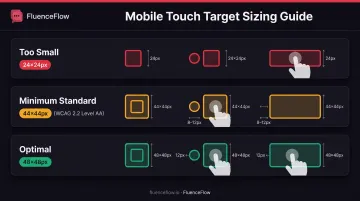
Small tap targets cause frustration and errors on mobile devices. WCAG 2.2 Level AA standards require minimum tap targets of 24×24 CSS pixels, but usability improves at 48×48 pixels.
Mobile-specific considerations:
- Space fields vertically to prevent accidental taps on adjacent inputs
- Make checkboxes and radio buttons large enough to tap comfortably
- Use mobile-optimized controls like steppers for quantity selection
- Leave at least 8–12 pixels of spacing between form elements
Testing and Optimizing Your Forms
Establish Baseline Metrics Before Optimization
You can't improve what you don't measure. Track these key metrics before making changes:
- Completion rate: percentage of users who start and finish the form
- Abandonment rate: where users drop off within the form
- Time to complete: how long successful submissions take
- Error rate: which fields generate the most validation errors
Use analytics, session recordings, or form analytics tools to identify friction points and prioritize improvements.
Conduct A/B Testing on Form Variations
Test changes systematically rather than redesigning everything at once. Even small modifications (button text, field order, validation timing) can lift conversion.
Test ideas:
- Single-column vs. current layout
- Top-aligned vs. left-aligned labels
- Inline validation vs. submit-only validation
- Multi-step vs. single-page for longer forms
- Different field groupings or section headings
Remember that context matters. A best practice that works for one audience or form type may not improve your specific situation. Test to confirm.
Gather User Feedback and Conduct Usability Testing
Watch real users attempt to complete your forms. You'll discover friction that analytics alone won't reveal:
- Confusing labels or unclear instructions
- Fields that require information users don't have readily available
- Validation rules that reject legitimate inputs
- Visual design elements that obscure form structure
Ask users to think aloud as they work through the form, and pay attention to hesitation, re-reading, or frustration.
FluenceFlow applies the same loop to email and SMS signup forms for DTC brands: baseline the popup, ship custom design directions, run A/B tests, and keep iterating on the data.
Clients on this process average 41% of total store revenue from retention channels.
Frequently Asked Questions
What are the four types of forms?
The four main e-commerce form types are registration/signup, checkout/payment, contact/inquiry, and data collection/survey. They cover account creation, purchases, support requests, and feedback or preference gathering.
What are the best practices for form validation?
Validate inline as users finish each field, not only on submit. Write specific error messages that say what’s wrong and how to fix it. Pair color, icons, and text for errors and positive cues like checkmarks.
What are the UI design best practices for forms?
Use single-column layouts with labels above fields, and keep required inputs to essentials only. Add inline validation with clear errors. On mobile, use the right keyboard types and tap targets large enough to hit reliably.
When should I use a multi-step form instead of a single-page form?
Use multi-step forms when you have 10–15+ required fields or clear logical groups (contact, shipping, payment). Show a progress indicator to ease length anxiety, and keep the total field count as low as you can.
How can I reduce form abandonment on mobile devices?
Trigger the right keyboard per field (numeric for phone, email for email) and keep tap targets at least 48×48 pixels. Place labels above fields, not placeholders only, and enable autofill with proper HTML attributes to cut typing.
Should I remove optional fields from my forms?
Yes, whenever possible; optional fields add friction even when skipped. Hide them behind an “Add additional information” link, or mark them “(optional)” if they must stay visible.