They hit the back button.
Welcome messages are your digital handshake, the moment that determines whether visitors stay, engage, and convert, or quietly disappear. A 2012 Google Research study found that visitors form aesthetic judgments about your website within 50 milliseconds, making that first message critical to user experience, bounce rates, and ultimately your bottom line.
This article walks you through crafting welcome messages that actually work. You'll learn a step-by-step process for writing compelling copy, discover which elements drive real engagement, identify common mistakes that kill conversions, and see real-world examples across different business models.
Key Takeaways
- Answer "What's in it for me?" up front with clarity, personality, and one clear next step
- Match intent: orient first-time visitors; recognize and relevantize returning ones
- Use static hero copy on content sites; value-led pop-ups for lead generation
- Personalized messages (by source or behavior) convert 202% better than generic ones (HubSpot, 330K+ CTAs)
How to Write a Welcome Message for Your Website (Step-by-Step)
Step 1: Define Your Website's Primary Purpose and Visitor Intent
Start by documenting why visitors actually come to your site. Open Google Analytics and examine your Traffic Acquisition report. Identify which channels bring the most valuable visitors and what actions they take. Look for patterns in landing pages, bounce rates by source, and conversion paths.
Next, clarify your primary conversion goal. Is it email signups? Product purchases? Contact form submissions? Resource downloads? Your welcome message should support this goal directly, not distract from it.
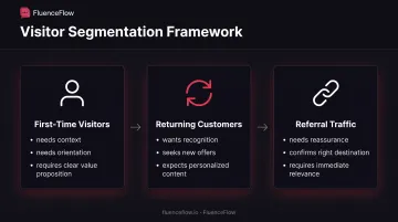
Map your visitor segments:
- First-time visitors need context and orientation
- Returning customers want recognition and new offers
- Referral traffic may need reassurance they're in the right place
Create a value proposition statement that answers the visitor's unspoken question: "What's in it for me?" This becomes the foundation of every welcome message variation you write.
Step 2: Choose the Right Format and Placement
Your format decision should match your website type and conversion goals. Each format has trade-offs:
Hero Section Text Works best for establishing identity and guiding visitors toward your main value proposition. NN/g's 2024 homepage research confirms that hero sections should state what your site offers and why visitors should care, not waste space with cheerful greetings.
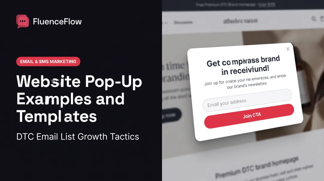
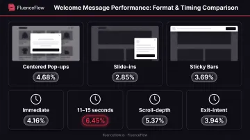
Welcome Pop-ups Sleeknote's 2025 analysis of 677 million impressions found centered pop-ups convert at 4.68%, slide-ins at 2.85%, and sticky bars at 3.69%. However, Google warns that obstructive interstitials can harm search performance and user experience. Use them strategically, not immediately.
Timing and Triggers Wisepops' 2025 data shows pop-ups triggered at 11-15 seconds achieve 6.45% conversion rates, compared to 4.16% for immediate pop-ups. Consider scroll-depth triggers (5.37%) versus exit-intent (3.94%) based on your goals.
Mobile Optimization With mobile accounting for nearly two-thirds of web traffic, test your welcome message extensively on actual devices. Ensure touch targets are large enough, text remains readable without zooming, and close buttons are clearly visible.
Step 3: Craft Your Core Welcome Message Copy
Start with an opening line that resonates with your visitor's specific situation. Instead of "Welcome to our website," try "Tired of email marketing that feels like shouting into the void?" or "Premium leather goods that actually get better with age."
Your value proposition should fit in 1-2 sentences. Explain what makes you different and why visitors should stay. Avoid industry jargon unless your audience expects it.
Add a specific call-to-action:
- "Start your free trial" (SaaS)
- "Shop new arrivals" (e-commerce)
- "Get the guide" (content sites)
- "See how it works" (services)
Keep your total message between 15-40 words. NN/g research shows concise, scannable copy improves usability by 47%-58% compared to lengthy explanations.
Step 4: Infuse Personality and Brand Voice
Pin down your brand voice first: professional or casual, playful or serious. Your welcome message should sound like the rest of your site.
Use language your audience actually uses. If you're targeting DTC e-commerce founders, phrases like "increase LTV" and "improve retention" resonate. If you're reaching everyday consumers, "get more value" and "stay connected" work better.
For consumer brands targeting younger demographics, consider conversational elements or subtle humor, but only if they align naturally with your brand. Don't force personality that doesn't fit.
Step 5: Optimize for Conversion and User Experience
Make your message scannable in three seconds by using visual hierarchy:
- Bold key phrases that capture your main benefit
- Use strategic line breaks that separate ideas
- Apply contrasting colors that draw attention to CTAs
Include trust indicators when appropriate. Northwestern's 2017 research found that products with five reviews had 270% higher purchase likelihood than products with none. Social proof builds that same immediate credibility in a welcome message.
Your CTA button should maintain design consistency with your overall site while standing out through color contrast. Ensure it connects seamlessly to the next step in your user journey.
Key Elements That Drive Welcome Message Engagement
Personalization Based on Context
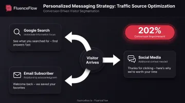
HubSpot's analysis of more than 330,000 CTAs found that personalized versions converted 202% better than basic CTAs. Apply this by tailoring welcome messages to:
Traffic Source
- Google searchers likely want immediate information
- Social media visitors may need more context
- Email subscribers expect acknowledgment of the relationship
Geographic Location
- Customize by region when location affects what you offer
- If you only serve certain cities, acknowledge that up front
Returning Visitors
- Skip the company intro they've already seen
- Highlight what's new or point them to a different next step
Emotional Resonance and Relatability
Connect with the challenge that brought visitors to your website. If you serve e-commerce brands struggling with retention, acknowledge that "most DTC brands leave 60-70% of revenue on the table by focusing only on acquisition."
Use "you" language consistently. "You'll discover strategies that turn one-time buyers into repeat customers" feels personal. "This guide covers retention strategies" feels corporate.
Share your mission only when it genuinely matters to the visitor. "We're on a mission to democratize access to..." rarely converts as well as "You get enterprise-level tools without enterprise pricing."
Visual Design and Readability
Design choices that keep the message easy to read:
- Meet WCAG 2.2 Level AA contrast (at least 4.5:1 text-to-background); low contrast raises bounce rates
- Give the message white space; clutter pulls attention off the words that matter
- Use legible fonts for body copy; save decorative typefaces for short headlines
Welcome Message Types by Use Case
Match the message to what the visitor came to do. The same welcome pattern rarely works for a store, a product app, and a publisher.
E-commerce Websites
Focus on immediate, tangible value that overcomes purchase hesitation:
- First-purchase incentives: "Welcome! Get 15% off your first order + free shipping over $50"
- Unique selling propositions: "Premium leather that gets better with age, backed by our lifetime guarantee"
- Product recommendations: "New here? Start with our bestsellers, chosen by 10,000+ customers"
Wisepops' 2025 data shows email-capture pop-ups offering discounts convert at 7.45% compared to 4.60% without incentives: a 62% relative improvement.
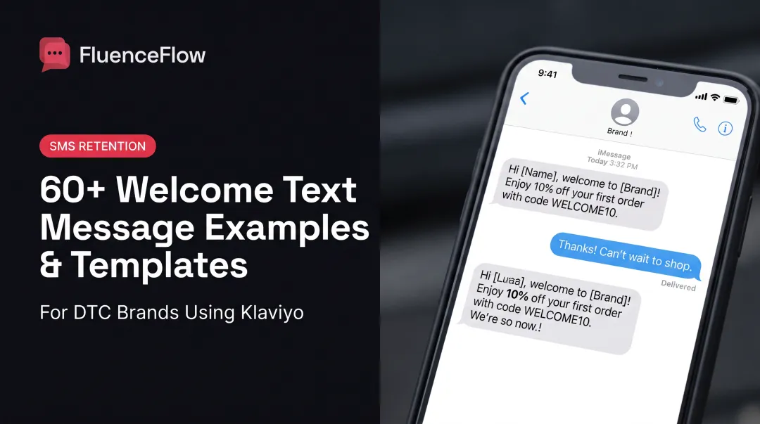
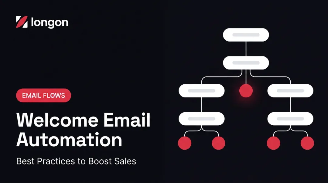
For DTC brands, that site message often feeds straight into automated email and SMS sequences. FluenceFlow connects those first touchpoints to Klaviyo welcome flows so a new subscriber gets a planned path to first purchase, not a one-off popup.
SaaS and Service Websites
Lead with the problem you solve and the outcome you enable:
- Problem-focused: "Ship better products faster. Join 50,000+ teams who've eliminated bottlenecks"
- Outcome-oriented: "Turn spreadsheet chaos into automated workflows in under 10 minutes"
- Authority signals: "Trusted by [notable client] and 500+ [industry] companies since [year]"
Offer low-friction conversions like free trials, product demos, or resource downloads. ChartMogul's 2026 survey found an 8% median free-to-paid conversion rate for SaaS products, so that first trial signup carries real weight.
Content and Educational Websites
Articulate your niche and unique perspective immediately:
- Topic clarity: "Weekly deep dives on retention marketing for DTC brands doing $50K–$5M/month"
- Value preview: "Join 100,000+ marketers getting actionable growth strategies every Tuesday"
- Frequency and format: "One long-form case study each week. No fluff, no filler"
Omnisend's 2025 analysis of 1.24 billion pop-up displays found a 2.1% average email-capture conversion rate. On content sites, a sharp promise of what subscribers get is what earns the opt-in.
Common Mistakes to Avoid When Writing Welcome Messages
Being Too Vague or Generic
A welcome line that could sit on any site in any industry wastes your highest-visibility real estate.
Watch for these traps:
- Generic openers like "Welcome! We're glad you're here" that say nothing about who you are
- Industry jargon first-time visitors won't know; "leveraging AI-powered solutions to streamline synergies" lands as noise, not value
- Clever wordplay that hides what you offer; if someone can't tell what the site does in a few seconds, the line failed
Speak plainly about what you do and why it matters to the person reading.
Overwhelming Visitors with Too Much Information
Your welcome message is a handshake, not a full pitch deck. Park deep detail on pages people can open when they're ready.
Common overload mistakes:
- Cramming your whole business model into one block of copy
- Stacking competing CTAs, such as "Sign up AND follow us AND read our blog AND shop now," which triggers choice overload (Nielsen Norman Group notes that too many options often block action entirely)
- Auto-dismissing the message too fast, or forcing extra clicks to close it, which strips users of control
One clear next step beats four competing ones.
Neglecting Mobile Optimization
Most visitors will see your welcome message on a phone first. Desktop-only design shows.
Mobile-specific failures to avoid:
- Skipping real-device testing; font sizes, touch targets, and layouts often break on smaller screens
- Full-screen pop-ups with no obvious close control; they frustrate users and can hurt rankings (Google warns against obstructive interstitials)
- Auto-play video or audio, which burns data and battery and turns a greeting into an interruption
Real-World Welcome Message Examples That Convert
These patterns show up on high-converting sites across SaaS, ecommerce, media, and services. Copy the structure, then swap in your numbers, offer, and audience.
Minimalist SaaS Approach
"Join 50,000+ teams who ship better products faster" paired with a simple "Start free trial" CTA combines social proof with outcome-focused language. Visitors see who uses the product, what they gain, and what to do next.
The number builds credibility. The line sells the result instead of a feature list, and the CTA keeps the next step frictionless.
E-commerce Incentive Strategy
"Get 15% off your first order + free shipping" with email capture knocks down two purchase barriers at once: price sensitivity and shipping costs. Wisepops' data shows this approach improves conversion by 62% compared to non-incentivized pop-ups.
Naming the exact discount and free shipping gives visitors a clear, calculable trade for their email.
Content Community Building
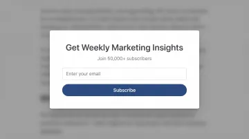
"Join 100,000+ readers getting weekly insights on [specific topic]" leans on social proof while setting expectations on frequency and focus.
You quantify the community, spell out what subscribers get, set the commitment (weekly), and own a defined topic instead of trying to speak to everyone.
Professional Services Credibility
"Helping [specific industry] companies achieve [specific outcome] since [year]" puts niche expertise and a measurable track record up front.
B2B buyers need proof you understand their challenges. Specific outcomes and a real tenure date build confidence where vague promises fall flat.
Frequently Asked Questions
What is a good welcome message for a website?
A good welcome message clearly states what visitors will find on your site, reflects your authentic brand personality, and includes a specific call-to-action guiding visitors toward their likely goal. It answers "What's in it for me?" in under 40 words without generic greetings.
What are some examples of good welcome messages?
E-commerce: "Premium outdoor gear built to last, get 10% off your first order"
SaaS: "Automate your workflows in minutes. Start your free trial, no credit card required"
Content: "Weekly marketing strategies for DTC brands. Join 50,000+ founders in our newsletter"
What is a good welcome message for customers?
Customer welcome messages should acknowledge their decision to engage, set expectations for what happens next, and provide immediate value. For example: "Thanks for signing up! Your 15% discount code is WELCOME15. Check your inbox in 2 minutes for your first exclusive insider update."
How long should a website welcome message be?
Most effective welcome messages range from 15-40 words. Messages exceeding 50 words see significantly lower engagement because visitors scan rather than read. Prioritize clarity and brevity over comprehensive explanation.
Should I use a pop-up or static welcome message?
Static hero messages work better on content sites when you want orientation without interruption. Pop-ups with exit-intent or scroll triggers suit lead gen; Sleeknote reports 4.68% conversion for centered formats. Test both with your audience.
Your welcome message is often your only guaranteed first impression. Keep it clear and specific, lead with visitor value, and point people to the next logical step.