
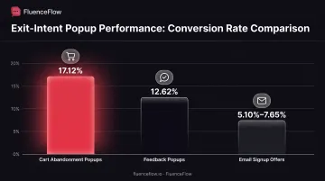
Exit-intent popups give you one last chance to convert visitors who are already on their way out. When designed strategically, they capture abandoning traffic at conversion rates that dwarf typical list-growth tactics. According to OptiMonk's performance data, cart-abandonment exit popups convert at 17.12%, while targeted email-capture offers convert between 5.10% and 7.65%.
This guide explains what exit-intent popups are, shows eight real-world examples matched to specific abandonment scenarios, and walks through the strategic implementation framework that turns departing visitors into revenue.
Key Takeaways
- Exit-intent popups fire on abandonment signals: cursor toward browser controls (desktop) or back-button/scroll-up (mobile)
- Cart-abandonment exit popups convert at 17.12% on average; email-signup offers hit 5.10%–7.65%
- Match offers to page context: discounts on cart exits, lead magnets on blogs, product picks for browsers
- Deploy first on high-intent pages: cart, checkout, pricing, and product pages
- Boost conversion with single-field forms, countdown timers, mobile layouts, and frequency caps
What is an Exit-Intent Popup?
An exit-intent popup is an overlay that appears when a visitor shows clear signals they're about to leave your site. Unlike entry popups or timed overlays, exit-intent technology waits until the moment of departure to interrupt.
How the technology works:
On desktop, JavaScript tracks your mouse cursor's velocity and direction. When you move toward the browser's top edge (where the close button, back button, and address bar live), the system interprets this as exit intent. OptinMonster's sensitivity settings range from Low (1 pixel from top), Medium (50 pixels), to High (150 pixels).
On mobile, cursor tracking doesn't exist. Instead, platforms rely on proxy signals: back-button detection, rapid upward scrolling, or idle time. Wisepops identifies back-button intent and scroll-up velocity as the most reliable mobile triggers, though both require careful calibration to avoid false positives.
Why exit-intent popups work:
Exit-intent works through pattern interruption. Visitors have already decided to leave, so the popup forces a moment of reconsideration at the threshold of abandonment. That last-chance decision point wouldn't exist otherwise.
Unlike entry or timed popups, which interrupt active browsing and can trigger Google's intrusive interstitial penalties, exit-intent overlays only appear when someone is already leaving. The Nielsen Norman Group notes this minimizes UX disruption because you're interrupting an exit, not engagement.
Performance benchmarks:
OptiMonk's data across thousands of campaigns shows clear conversion ranges by type:
- Cart-abandonment exit popups: 17.12%
- Feedback popups: 12.62%
- Email-signup offers: 5.10%–7.65%
Offer quality drives wide swings. One retailer's free-shipping exit offer converted 664 visitors from 11,818 impressions, an 8.4% rate.
Exit-Intent Popup Examples
Example 1: E-commerce Discount Offer for Cart Abandonment
Scenario: A visitor has added products to their cart but moves their cursor toward the browser close button before reaching checkout.
Offer structure:
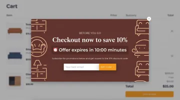
- Percentage or dollar-amount discount with unique code (10%–20% is common)
- Countdown timer showing 10–15 minutes remaining
- Bold headline: "Wait! Here's 15% off your order"
- Single-field email capture to receive the code
- Prominent CTA button
Why it works:
Price hesitation is the top cart-abandonment reason. A discount gives shoppers a reason to finish checkout now, and the countdown creates FOMO so the decision happens in-session instead of "later."
Kiss My Keto used a 15%-off exit popup with a 15-minute countdown and hit a 15.05% conversion rate. Natural Vital paired a free gift with a countdown for cart abandoners and reached a 31.42% conversion rate over 26 days.
Example 2: Lead Magnet Popup on Blog Content
Scenario: A visitor finishes reading an educational blog post and shows exit intent while scrolling back up.
Offer structure:
- Content upgrade specific to the post topic (checklist, template, PDF guide)
- Headline tied directly to the article: "Get the Complete SEO Checklist"
- Email field to deliver the download
- Visual preview of the lead magnet
Why it works:
The upgrade builds on content the visitor just finished, so it feels relevant and low-commitment. You capture readers at peak interest, and they enter the funnel already caring about the topic.
Content-based exit popups typically convert between 5.10% and 7.65% per OptiMonk benchmarks. Results hinge on how tightly the offer matches the article.
Example 3: Free Sample or Trial Offer for Consumable Products
Scenario: A visitor browses product pages for subscription items like supplements, pet food, or coffee but doesn't add anything to cart.
Offer structure:
- Free sample with shipping-only cost ($4.95 is common)
- Extended free trial (30 days instead of 7)
- Headline that stresses a risk-free try
- Clear product image and benefit callouts
Why it works:
Consumables need taste, texture, or preference proof before someone commits to reorders. A sample removes that risk for browsers who won't buy blind. Because LTV comes from replenishment, the sample cost is a customer-acquisition investment, not a lost margin line.
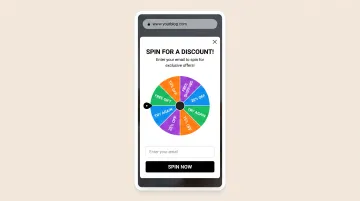
Example 4: Spin-to-Win Gamification Popup
Scenario: A visitor browses your homepage or category pages but shows exit intent before viewing products in depth.
Offer structure:
- Interactive wheel with multiple discount tiers (5% to 25% off)
- Email address required to spin
- Every spin "wins" something (even if just 5% off)
- Colorful, engaging design with animation
Why it works:
Gamification turns the opt-in into a game instead of a form fill. Variable rewards (you don't know which discount you'll get) drive engagement, and the ask is tiny: just an email to play. Visitors who never planned to hunt for a code still spin because the mechanic feels new.
BlendJet's spin-to-win exit popup captured 15,000 email subscribers (conversion rate not published).
Example 5: Product Recommendation Popup
Scenario: A visitor views multiple products across different categories but doesn't add anything to cart, then moves to exit.
Offer structure:
- "Based on what you viewed, we recommend..."
- 2-4 product cards with images, names, prices
- CTA buttons leading directly to product pages
- Optional: "Not interested? Get 10% off instead"
Why it works:
Large catalogs create analysis paralysis. Curated picks based on real browsing behavior cut decision friction and surface products the visitor may have missed. The "or get a discount" fallback still catches people who aren't ready to browse more.
Example 6: Free Shipping Threshold Reminder
Scenario: A visitor has items in cart but the total is $8 below your $50 free-shipping minimum.
Offer structure:
- Visual progress bar: "You're $8 away from free shipping!"
- Cart summary showing current items
- 2-3 suggested add-on products under $15
- "Add to cart" buttons for suggested items
Why it works:
Free shipping ranks among the strongest purchase motivators. A progress bar taps the goal-gradient effect: people push harder when they can see they're close. Suggested add-ons make the threshold easy to hit, and shoppers feel like they're saving on shipping rather than spending more.
C21, a major NYC retailer, used a free-shipping exit offer and converted 664 visitors from 11,818 impressions (8.4% conversion rate).
Example 7: Exit Survey for Feedback Collection
Scenario: A visitor leaves your pricing page or product page without converting.
Offer structure:
- One-question survey: "What stopped you from purchasing today?"
- Multiple-choice answers (price, features, not ready, need more info)
- Optional email field for follow-up
- "Thank you" message after submission
Why it works:
Instead of forcing a sale, you collect data on what blocked the purchase. Those answers guide later optimization, and shoppers often respond well when you ask instead of assume.
OptiMonk reports feedback popups convert at 12.62%, higher than standard email signups, because the ask is lighter and the exchange feels fair.
Example 8: Seasonal or Event-Based Promotional Popup
Scenario: A visitor browses during Black Friday, holiday season, or a product launch event.
Offer structure:
- Time-limited promotion tied to the event
- Countdown timer showing hours/minutes until event ends
- Exclusive early-access language or limited-inventory messaging
- Seasonal design elements (holiday colors, sale badges)
Why it works:
Shoppers show up to big events already primed for deals. Your exit offer matches that mindset instead of introducing a new pitch, and scarcity (limited time or inventory) pushes action before the window closes.
SwissWatchExpo ran a $100 discount plus free shipping with a 15-minute expiration and saw online transactions rise 25% year over year.
Exit-Intent Popup Best Practices
Offer Strategy: Match Offer to Visitor Intent and Page Context
The same offer won't work across your entire site. Cart abandoners need different incentives than blog readers.
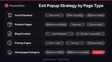
Segment by page type:
- Cart/checkout pages: Discounts, free shipping, payment-plan options
- Product pages: Product recommendations, reviews/social proof, satisfaction guarantees
- Blog/content pages: Lead magnets, content upgrades, email courses
- Pricing pages: Free trials, demos, competitor comparisons
- Homepage/category pages: Gamified offers, general discounts, new-visitor welcome
Segment by traffic source:
Justuno supports personalizing exit offers by campaign, traffic source, and visitor behavior.
Paid traffic should see offers matching the ad promise they clicked on. Organic traffic from informational queries responds better to educational content. Returning visitors already saw your first-time offer; show them something new.
Tailor by business model:
Your unit economics dictate which offers are sustainable:
- High AOV/Low Frequency brands (premium products, long decision cycles): Financing options, extended guarantees, educational content. Discounts can damage brand positioning at $400+ price points.
- Low AOV/High Frequency brands (consumables, CPG): Aggressive first-purchase incentives, subscribe-and-save offers. Profitability comes from repeat orders, so initial acquisition cost can be higher.
- Mid AOV/Mid Frequency brands (large catalogs, tight margins): Free-shipping thresholds, product-recommendation popups. Direct traffic toward bestsellers and high-margin items rather than blanket discounts.
Agencies like FluenceFlow design exit popups around these economics rather than generic templates, matching offers to actual contribution margin and customer lifetime value.
Design and Copy: Create for Instant Comprehension
Visitors are already leaving. You have 2-3 seconds to communicate value.
Form field optimization:
Generic popup research suggests 1-3 form fields convert best. For exit-intent specifically, single-field email capture reduces friction when immediate conversion isn't the goal. Only ask for SMS or additional data if the value exchange justifies it.
Headline formulas:
Lead with the specific benefit, not vague urgency. "Get 15% off your order" outperforms "Don't leave yet!" because it states the value immediately. Include the offer value in your headline. Tests show direct benefit statements improve performance.
Visual hierarchy:
- Headline first (largest text, high contrast)
- Offer details second (specific discount code, lead magnet preview)
- CTA button third (contrasting color, action-oriented copy)
- Form field last (single line, minimal friction)
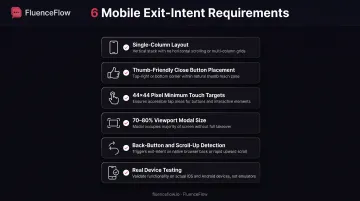
Mobile layouts require single-column design with tap targets at least 44×44 pixels. Wisepops recommends modal size between 70-80% of viewport rather than full-screen to preserve context and reduce intrusiveness.
Timing and Frequency: Optimize Trigger Sensitivity and Display Rules
Desktop sensitivity settings:
OptinMonster defines Low (1 pixel from top), Medium (50 pixels), and High (150 pixels) sensitivity thresholds. Medium balances false positives from quick upward scrolling against missed opportunities from slow cursor movement.
Mobile sensitivity settings:
Mobile detection uses upward-scroll percentage. OptinMonster maps Low/Medium/High to 50%/30%/10% of device height scrolled upward. Start with Medium and adjust based on false-positive rates in your analytics.
Frequency capping:
Show once per session at minimum. OptinMonster's cookie system tracks shown, closed, and converted states, allowing you to suppress after any of these events. For returning visitors, consider:
- 7 days for impulse-purchase products
- 14-30 days for considered purchases
- Immediate permanent suppression after conversion
Exclusion rules:
- Never show to existing customers (if identifiable)
- Suppress on thank-you and confirmation pages
- Exclude from account/dashboard pages
- Disable after popup conversion to avoid pestering
Mobile Optimization: Address Mobile-Specific Challenges
Desktop cursor tracking is reliable. Mobile exit detection uses proxy signals with varying accuracy.
Mobile detection methods:
Wisepops identifies back-button intent and rapid upward scrolling as the most reliable mobile triggers. Tab-switch detection only fires when users return to the tab. Idle-time triggers often produce false positives because inactivity doesn't necessarily signal exit intent.
Mobile limitations:
- Android Chrome requires prior page interaction for back-button override
- In-app browsers (Facebook, Instagram) don't support back-button or scroll-up detection
- Scroll thresholds need careful calibration; too sensitive triggers prematurely, too high misses exits
Mobile design requirements:
- Single-column layout, no side-by-side elements
- Close button in thumb-friendly position (top-right or bottom)
- Form fields large enough for touch input (minimum 44×44 pixels)
- Modal size 70-80% of viewport, not full-screen
- Test on actual devices, not just desktop browser emulation
If false-positive rates exceed 20% or your platform lacks reliable mobile exit detection, consider disabling mobile exit-intent and using scroll-triggered or time-delay popups instead.
Testing and Optimization: Use Data to Improve Performance
A/B testing priority:
Start with offer variations; they have the highest leverage. Test 10% off vs. 15% off, discount vs. free shipping, discount vs. lead magnet. Once you've identified the winning offer, test:
- Headline copy and value communication
- CTA button text and color
- Number of form fields
- Visual layout and imagery
OptinMonster supports testing headlines, layouts, images, CTAs, and offers while tracking impressions, leads, and conversion rate.
Metrics to track:
- Conversion rate: Completions divided by impressions
- Revenue per visitor: Total attributed revenue divided by unique visitors
- Cart recovery rate: For cart-abandonment popups specifically
- Email capture rate: New subscribers from popup
- Segment performance: Compare by traffic source, device, page type
Analysis tools:
Heatmaps and session recordings reveal engagement patterns: where users click, how long they read, and whether they notice your CTA. Funnel analytics identify which pages generate the most valuable exit-intent conversions.
Post-Capture Strategy: Connect Exit Popups to Retention Marketing
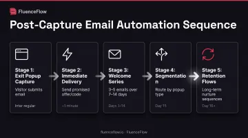
Capturing the email is step one. The revenue comes from what happens next.
Email welcome sequence:
Immediately deliver the promised offer (discount code, lead magnet download). Follow with a 3-5 email series over 7-14 days that:
- Reinforces the value proposition
- Shares social proof and reviews
- Educates on product use cases
- Presents complementary products
- Creates urgency with limited-time messaging
Segment by the interest shown in the popup; someone who requested a content upgrade differs from someone who wanted a discount code.
SMS follow-up for e-commerce:
For customers who convert after the exit popup, SMS supports:
- Order confirmation and shipping updates
- Delivery notifications
- Product-usage tips post-delivery
- Replenishment reminders based on consumption cycle
Retention marketing integration:
Agencies like FluenceFlow build custom Klaviyo flows that nurture leads captured through exit popups based on unit economics. The popup feeds zero-party data into automated sequences, turning single captures into long-term customer relationships. Cart abandoners enter recovery flows, content leads enter educational nurture, product browsers receive personalized recommendations.
The popup is list growth. The flows are revenue generation.
How to Implement Exit-Intent Popups for Your Store
Pick a platform that fits your stack, then configure triggers, frequency caps, and ESP integration before you launch.
Platform options
| Platform | Best For | Exit-Intent Capability |
|---|---|---|
| Alia | Shopify + Klaviyo brands | Native Klaviyo sync, desktop and mobile exit signals, built for DTC list growth |
| OptinMonster | Shopify, WordPress, standalone sites | Desktop cursor and mobile scroll detection, configurable sensitivity, A/B testing |
| Wisepops | Ecommerce with heavy mobile traffic | Desktop tracking plus mobile back-button and scroll-up signals (mobile has limits) |
| Popup Maker | WordPress | Mouse-leave, back-button, and mobile-scroll controls via premium extension |
| ConvertFlow | Shopify and standalone | Desktop viewport-exit, mobile back-button, audience targeting, Shopify builder |
Selection criteria
- Reliable exit-intent detection on desktop and mobile
- Built-in A/B testing
- Integration with your email/SMS platform (Klaviyo, Mailchimp, Omnisend)
- Strong templates and customization options
- Cookie-based frequency capping
Implementation steps
- Select a high-intent page: Start with cart or product pages where visitor intent is highest
- Match the template to the job: Discount for cart recovery, lead magnet for content, recommendations for product browsers
- Configure exit triggers: Desktop sensitivity Medium (50 pixels); mobile Medium (30% scroll)
- Set a frequency cap: Once per session minimum; 7–30 days for returning visitors based on buying cycle
- Connect your email platform: Route form submissions to your ESP and verify list assignment plus consent text
- Test every path: Desktop exit, mobile back/scroll, close action, form submission, conversion tracking
- Run a 2-week baseline: Track impressions, conversions, and revenue attribution before you change anything
Test in a private browser window or after clearing cookies so you see the first-time visitor experience.
Frequently Asked Questions
What is an exit-intent popup?
An exit-intent popup is an overlay triggered when a visitor shows clear abandonment signals, such as moving their cursor toward the browser's close button on desktop or pressing the back button on mobile. It displays a targeted offer to retain the visitor before they leave.
What are some examples of exit-intent popups?
Common types include cart-abandonment discounts (10%–20% off), blog lead magnets (checklists or templates), free-shipping offers, and spin-to-win wheels for email capture. The strongest examples match the offer to the page and visitor intent.
What is a good conversion rate for exit-intent popups?
OptiMonk reports cart-abandonment popups convert at about 17.12% on average, while email-signup offers typically land between 5.10% and 7.65%. Targeted offers on high-intent pages outperform generic homepage overlays.
Do exit-intent popups work on mobile devices?
Yes, though less reliably than desktop. Mobile detection relies on back-button intent, rapid upward scrolling, and idle time. Wisepops recommends those signals as primary triggers, with careful sensitivity tuning to limit false positives.
How do I create an exit-intent popup for my Shopify store?
Install a Shopify popup app with exit-intent features like OptinMonster, Wisepops, or ConvertFlow. Build the campaign, set desktop and mobile triggers, connect your email platform (Klaviyo is common on Shopify), add frequency caps, and test before launch.
Should I offer a discount in my exit-intent popup?
Discounts work best on cart and product-page exits where price is the main barrier. On content pages, lead magnets like guides or checklists usually convert better; match the offer to intent, not a one-size-fits-all discount.